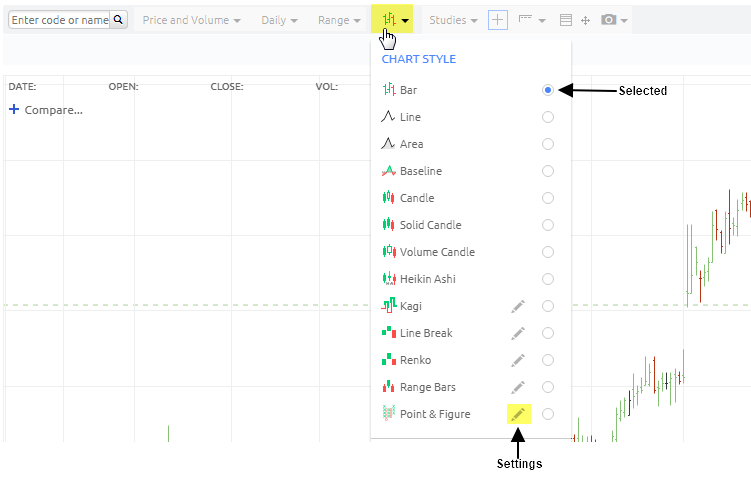
You can alternate how prices are displayed on the chart and select between a Bar (Open High Low Close), Line, Area, Baseline, Candle, Solid Candle, Volume Candle, Heikin Ashi, Kagi, Line Break, Renko, Range Bars and Point & Figure view for share price graphs.

 Bar
Bar
Bar charts consist of vertical lines with a horizontal "shelves" on either side. One "bar" is created for each interval (period) on the chart. Each bar represents the OHLC (Open, High, Low, Close) for the period. The top and bottom of the vertical line represent the high and low for the period.
 Line
Line
A line chart consists of segments that connect at the "Close" price for each time period.
 Area
Area
Area Charts are line charts with a shaded section that extends to the bottom of the chart. The result is a chart which looks like a mountain.
 Baseline
A baseline delta chart draws a line chart that oscillates across a dotted baseline. The area above the baseline is shaded green, and the area below the baseline is shaded red. The baseline initialises to the left most closing value on the chart but can be adjusted by dragging the handle located on the right side of the chart.
This chart style is meant to highlight the positive and negative distance from the set baseline. It is typically used for "intraday" charts where the left side (baseline) is set to the opening of the market day.
 Candle
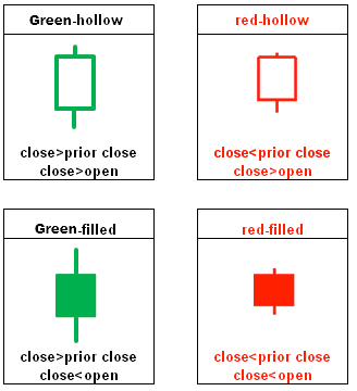
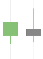
Like bar charts, candle charts represent OHLC except in the form of colored rectangles called ‘candles’. When the open is lower than the close, the candle is shaded green. When the open is higher than the close, the candle is shaded red. If the open and close are the same, a thin horizontal line segment is drawn at that price (this type of candle is called a "dojo"). Each candle has a ‘wick’ that extends beyond the candle to indicate the high and low, respectively.
Grey candles are created when the close price of the candle is same as the previous close candle.
 Volume Candle
A volume candle chart is a hollow candle chart where the width of a candle varies to indicate volume. Each candle’s shading and fill follow the same conventions as those in hollow candle charts. Wide candles indicate high volume, while narrow candles indicate low volume.
 Heikin-Ashi
Heikin-Ashi charts are time series charts that resemble candle charts. In a normal candle chart, each candle is calculated independent of the other candles. However in Heikin-Ashi charts, the candles appear to link together as a consequence of how they are calculated. The candles are calculated as such:
- Open = the mean of the previous open and the previous close
- Close = the mean of the current open, close, high, and low
- High = the maximum of the current high, open and close
- Low = the minimum of the current low, open and close
Upward trends are indicated by green candles with wicks on top, but almost no wick on bottom. Downward trends are indicated by red candles with wicks on the bottom and almost no wick on top. Reversal points are indicated by candles, red or green, with small bodies and wicks on top and bottom. This chart type is useful in spotting trends more clearly and easily than regular candle charts.
 Kagi
Kagi
Kagi charts appear as vertical bars connected by small horizontal segments at right angles. These charts are independent of time and progress forward based on price action. Thick green bars, called ‘Yang’ bars, indicate that a price has broken-out above the previous high price. Thin red bars, called ‘Yin’ bars, indicate that the price has fallen below the previous low. Unlike the other chart types, the colors of kagi lines do not directly communicate upward or downward trends.
Bars move upward or downward depending on closing prices. A bar will shift direction when a reversal limit is reached. Reversal limits are input by the user as a fixed percentage of the price. For example, imagine you have a stock valued at 10 dollars and you are drawing a kagi chart with a reversal of 10%. Depending on what trend was currently established, a cumulative 1 dollar movement in the opposite direction will break the current trend and cause a reversal.
 Line Break
Line break charts appear as vertical bars that ascend and descend. These charts are independent of time and are determined only by price action. Ascending bars are colored green and indicate upward price action. Descending bars are colored red, and indicate downward price action.
Line break charts are constructed by looking at the close of a bar and comparing it to a previous bar’s close (which bar to compare is determined by the user, see below). If the current bar’s close is higher than the one it is being compared to, a green ascending bar is drawn. If the current bar’s close is lower than the one that it is being compared to, a red descending bar is drawn. If the current close is the same, or if the price does not move enough in one direction or the other to signify a reversal, then no bar is drawn.
Line break charts default a value of 3, meaning it compares the current bar’s close to the bar that came 2 periods earlier.
 Renko
Renko
Renko charts appear as a sequence of uniformly sized bars (referred to as ‘bricks’) that connect at their corners. These charts are independent of time and are determined only by price action. Ascending bricks are colored green, and descending bricks are colored red.
Renko charts are constructed by assigning a ‘range’ value for each brick to represent. A new brick is drawn when the price moves above or below the amount signified by the previous brick. For example, let’s say you have an equity valued at 100 dollars and you’re plotting a Renko chart with a range value of 10. The next day the price closes at 109 dollars, so no new brick is drawn. The day after that the price closes at 111 dollars, which causes a new brick to be drawn because the price has increased at least 10 dollars from the previous brick. The next day the price drops to 99 dollars, which causes two downward trending bricks to be drawn.
 Range Bars
Range bars appear as a sequence of uniformly sized bars that connect at their corners and sometimes sit adjacent to one another. These charts are independent of time and are determined only by price action. Ascending bars are colored green, and descending bars are colored red.
Range bars are constructed by assigning a ‘range’ value for each bar to represent. A new bar is drawn when the price moves above or below the amount signified by the previous range bar. Ascending bars adjacent to descending bars indicates price oscillation between the high and low of the bars. Bars obey three rules of construction:
- Bars extend the length of the specified range.
- Bars open at the close of the previous bar.
- Bars must close at either the high or low value.
 Point and Figure
Point & figure charts appear as alternating columns of X’s and O’s. These charts are independent of time and are determined only by price action. The X columns indicate upward price action, and are colored green. The O columns indicate downward price action, and are coloured red.
Point & figure charts are constructed by specifying a ‘box size’ and a ‘reversal’ amount. Box size indicates the number of units the price must move in order for an X or O to be drawn in a series. The default value for box size is 1. The reversal is the number of units the price must move in the opposite direction for the current trend to switch. The default value for reversal is 3. Pressing the ‘Auto Select’ button will set the default values for both fields.
As an example, let’s say you have an equity that is valued at 10 dollars and you are plotting a point and figure chart with a box size of 1, and a reversal of 3. Your stock increases to 15 dollars, and a column of five ascending X’s is drawn. As this trend continues, more X’s will be added to that column. To break this trend, the price will have to drop at least 3 dollars, and a column of descending O’s will begin.